


Quizizz is mainly used for a review use case, which is a once-a-month use case. Although Quizizz hosts a vast public library with resources on every granularity, there is some gap when communicating this to the teachers. We paired up these resources with the widely used standards and curricula that teachers rely on and aced the high frequency use case.

Overview
Standards and curriculum alignment is something that teachers seek within resources. The goal here is to provide a catalog-like experience where teachers can find standards and curriculum aligned resources for every topic.
Results

Process
A framework is a list of skills that a student should know in a particular grade. These skills are called standards. While browsing for teaching resources online, teachers often try to align the content with these standards.
Same is the case for different curricula. Teachers use curricula for supplemental instruction and assessment. Generally, it is difficult to find content aligned to these curricula.
In previous months, we learned that with the vast number of resources available online, teachers don't have a go-to platform to get content on standards or curricula. This was a big pain point for them, because schools demanded standards-aligned instruction.
Hence, we define the problem statement as:
There is no platform that provides high quality, standards and curriculum aligned resources for instruction. This is a pain point for teachers because all schools demand standards and curriculum alignment.
Our learnings here have been:
The goal here is to create a collection of resources. These resources will be mapped to standards and curricula. And to have resources for every granularity.
Completion rate:
After initial explorations, we understood that the end product might have a complicated navigation. Hence, kept a goal to track the percentage of users finally ending up at a desired resource.
Shares:
This is an experience that will be useful for all teachers. For a teacher who is exposed to this experience, they should find it useful, and share it with other teachers from their department or school.
Repeat usage:
As pointed out earlier, teachers will teach consecutive topics in a week. Hence, after completing an activity, they should com back to the experience for the next one.
Successful hosts:
This goes without saying. At Quizizz, meaningful hosts are the defining metric of the usefulness of our platform.
Improved search terms:
Our hypothesis was, with the education that Quizizz has resources on every granular topic, the search terms would become more granular and more refined, which ultimately contributes to higher search success rate.
Activation:
This was an unprecedented success. In our analysis, we found that new users exposed to this experience were activating at a much higher rate.
Perception of Quizizz:
This also aligns with our long-term goal of building the perception of Quizizz as a high-quality, trustworthy platform.
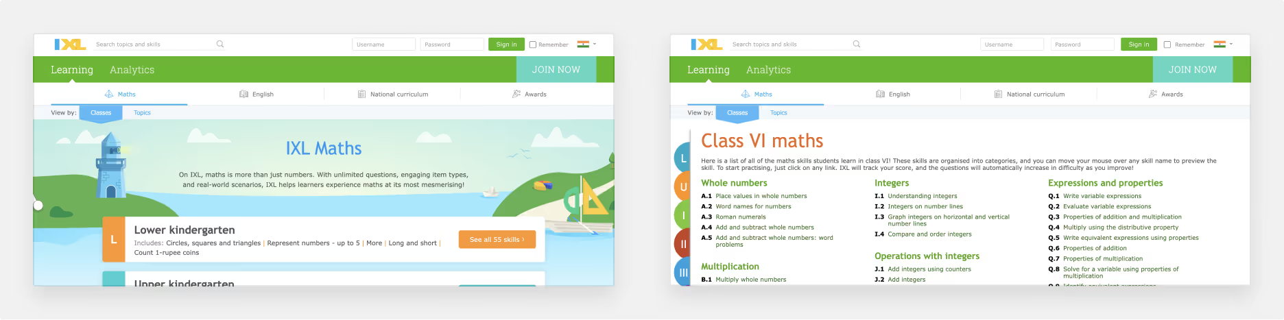
I used several platforms that try something similar.
This is a catalog that teachers use to know the relation between different standards like prerequisites.

Widely used by teachers for Math practice.
Official website for the NGSS framework.

I also looked at some other competitors trying to solve this problem.
Here are the all the key insights I gathered:
Before jumping on to the designs, I saw it relevant to lay down some design principles:
Keeping in mind these, let's move on to see how the design evolved.
With all these insights in mind, let's see how the designs evolved over time.
These were for an early concept when we had only curated resources for standards and not curricula.

With feedback from both user calls as well as within the company, we understood that:
The further iterations are some later ones with curricula added as well. Let's look at the attempts with these learnings.
We finally went ahead with the click-based approach.
The navigation decided was:
Subject -> Curriculum -> Grade + Domain -> Topic -> Resources


The initial feedback was very positive. Teachers loved having all content at one place.
After analysing the data, we found out that:
Hence, we combined some steps into one:

In our user calls and while seeing user recordings, we noted that teachers extensively use the sidebar for navigating the content. This is because they know what topic they want to drill down to.
While the table of content on the right is very comprehensive and a very good use case for first-time browsing and grasping the breadth of content, the tree served as the main navigation when teachers actually wanted to find content.
Hence, we decided to skip a step again, and combine the last 2 steps into a single one:

Also, somewhere in between, we also added resources at not only the most granular level, but also at the unit level, which will be used for unit reviews.
These were some insights which helped us improve the overall experience. With some additional changes such as an intermediate grade selector modal and unit review resources, here is the final solution.
Final solution
Here is how a teacher navigates through the resource library:
Extras
The results were very fruitful from the start and appreciated by all:

We also saw a lot of users hosting sequential topics in consecutive days. These were users who were earlier LF users, which transitioned to HF users.

Interestingly, a small cohort of teachers completely moved away from the public library experience and started hosting exclusively from the browse experience, giving us further confidence that this might be how teachers use our platform in the future.
Just after the rollout, we saw tons of mails from teachers asking for more resources, more curricula, more grades, and more use cases. We are slowly tackling coverage, our first priority being improving the quality of resources.


I thought of classifying the types of resources available into teacher JTBDs. This would further help them in selecting which resources to host in different parts of their journey.

Unfortunately, this could not be executed due to our low confidence in tagging these resources to such JTBDs.
In the month of April, teachers are assessing students on content taught throughout the year. These tests are also aligned to state standards and are hence called state tests. I had the idea of adding such year-review resources in our experience.

All in all, this was a huge success, and we are still working to increase coverage and uplift quality.


